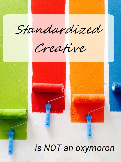
As modern marketers in the age of ‘brand globally’, we truly understand the need for visual consistency and message clarity across business units, different geographic regions and even from tactic to tactic. This ensures there is continuity across a company’s internal and external touch points.
But it doesn’t mean your marketing materials need to be dull. It should be a formula that still adds up to your full brand identity when the right variables are used.
 For us, we find it’s always good to practice what you preach. So, we’ve used a video in this instance to show how it’s possible to employ ‘standardized creative.’ Don’t believe us? Compare it to our new website. Are there different elements, yet are the two tied closely together? Of course! We’ve standardized our brand elements, yet given ourselves the ability to let our personality shine.
Your brand guidelines need an element of flexibility
Taking your ‘branding guidelines’ too literally can actually hurt your company’s ability to truly define your brand identity—the critical message (or feeling, if you will) that you want the world to associate with your brand.
Too often, corporations think they will lose their brand image if they stray from the well-defined guidelines, but nothing could be farther from the truth. Although your guidelines set boundaries, there will be cases where you can move past those limitation a bit as well as find ways to work within the defined structure to make your message resonant and your imagery compel people to act.
Even we, as a marketing communications firm, walk that fine line between brand guidelines and creative expression. The point is, no business is immune from needing to set its stake in the ground and say, “This is what I am, world, love me or leave me!”
Smart strategies balance guidelines with creative interpretation
Here are some things to remember when balancing your corporate guidelines with your need to differentiate your brand:
1. They’re guidelines, not gospel. While they should not be ignored, branding guidelines should not be adhered to so closely that you limit the ways you can differentiate yourself in the market. Embrace the creative clexibility you do have, even if the tactic you’re using has a pre-defined structure that imposes limitations (such as an email template or ad design that restricts a part of your layout). That doesn’t mean it can’t be engaging, unique and impactful.
2. Consistency across elements is essential to ensure your brand is recognized among your mature customers as well as in new markets. the logo treatment, a common color scheme and the positioning of certain branding elements should be more rigid. Don’t think of this as hindering some of your creative abilities. The guidelines should not box you into a design that is useless or uninviting, but the standardization of certain elements makes your brand recognizable.
3. Trying to please everyone and represent all markets may not always be the best option, especially if all your are left with is a watered-down version of your message or way too many details. Sometimes you need to prioritize what can be included in order to make the most impact with the audience you’re targeting. Trade show booths are notorious for this, since they are used across multiple events representing different industries. Design your booth with elements that let you cost-effectively swap out sections for graphics that match the event.
4. If you need to break free, push the boundaries on some campaign elements, not your overall brand image. When trying something out of the norm, do it on a smaller scale versus implementing a company-wide mandatre to change a major brand element (like your color scheme). This will also give geographic regions the ability to interpret your guidelines in a way that lets them create campaigns that resonate with their local customer base.
5. Have an internal brand champion as well as the help of an external team to evaluate materials. They will make sure the boundaries aren’t pushed too far and the message is still on target. This way you can ensure your brand identity is being properly represented from the inside and out.
Overall, remember that a truly integrated marcom plan will utilize multiple formats to deliver your message across multiple channels. Your message and design will be altered to optimize the format, but everything should still look and feel cohesive across all branded pieces.
